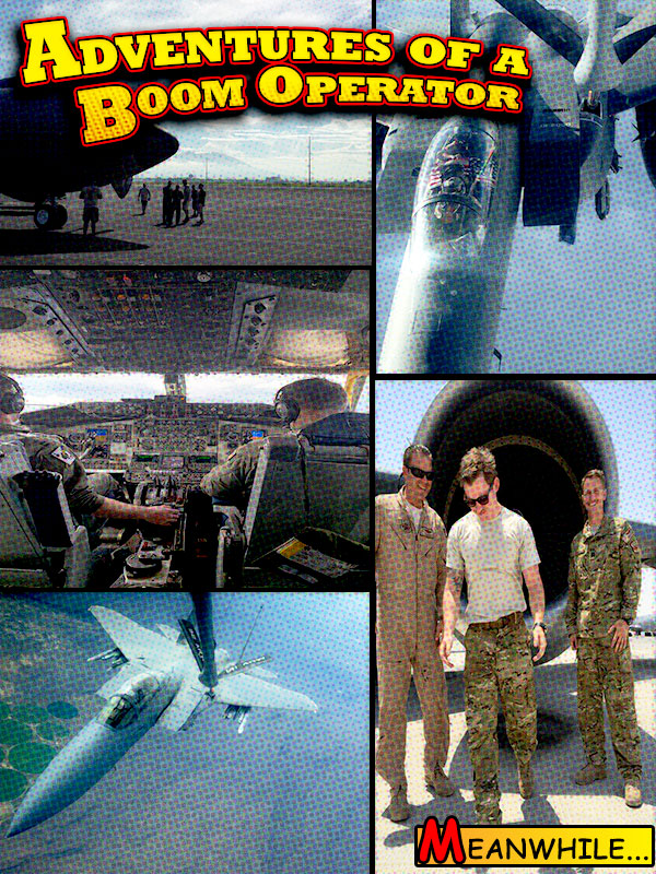
With the title of my blog being “Adventures of a Boom Operator”, I decided to go with a comic book theme graphic design. Using the idea of intellectual unity to combine my title, photos, and design to create a story. At first the design started as a collage and I realized there was nothing that made it stand out. As the pictures sat there, I had originally used the white borders we had used in a previous project and saw the comic book setting being built.
I gathered each photo and utilized the filter gallery. From there I used the filter “Grain” to help distort the pictures slightly. After using the filter, I used “color halftone” to give it more of a drawing look. This helped me create the idea that the images were drawn like a comic book would be. With some of the feedback that I received, the most comment note was that my pictures were too dark and lacked “pop” in color. With this feedback, I went back and adjusted the brightness/contrast using the slides. I was having a little bit of difficulty doing this as the layer is a “smart object”, which in Photoshop it turns each individual photo into one layer. This was useful when applying the filters but became a nuisance when trying to brighten pictures individually.
Here is when I found that I could right click and “edit contents”. This allowed me to achieve brightness for individual photos. The other piece of feedback I received was that the photos did not align correctly or were spaced too far. This is where I ran into a problem once again with the “smart object”. With the layer being a “smart object” I could not go back and move or re-size photos accordingly. At first, I felt defeated but after wandering around Photoshop I realized that the “edit contents”, once again, it creates that layer into a separate canvas. This allows you to do all the originally editing you need. I was able to correct the photos alignment and agree that the image looks much cleaner now.
The title was the most common compliment I received and decided to keep it as is. I feel the title alone really brings the comic book feel to life. After the reading the typography section, it helped me avoid mistakes like underlining and using the appropriate bolded items. Overall, I was satisfied with this design as I am a huge comic book fan and I feel like it is something “different”. I hope to continue this idea and make the Boom Operator almost seem like a superhero. This will play from another post that I had posted earlier in the semester about unsung heroes.
All photos are owned by myself.
